bioGraphic

A publication design system that moved story layout from designers to editors

Project Overview

bioGraphic is a multimedia science publication created by the California Academy of Sciences. I joined the project in 2015 to help shape and coordinate its development, supported its launch in 2016, and led its transition to a new platform in 2018.

The project included content taxonomy, a metadata-driven module library, written documentation, user testing, and a migration of more than 150 published stories.

My Goal

Create an immersive, accessible publication that could bring together long-form science, rich media, and data visualization without sacrificing editorial flexibility.

That meant designing more than a collection of engaging pages. It required a flexible, scalable system that editors could use to build distinctive stories without relying on a designer for every layout.

Team and collaboration

I worked with a small core team, along with writers and photographers commissioned for individual stories. The original platform was built in partnership with an external developer.

As the project's sole design creative, I led the visual design, content structure, interaction patterns and publishing system, collaborating with editors and contributors throughout. How editors actually used the templates shaped what I built next.

Platforms

Launched on Storied in 2016. Migrated to WordPress with Divi in 2018, where it ran until July 2026.

I gradually took on front-end development before the migration, which let me iterate more directly between design and implementation. After the 2018 rebuild I became the publication's primary developer.

Role and Contributions

Information architecture
Interaction design
Design system and documentation
User testing
Accessibility and responsive legibility
Front-end development

The Problem

Four requirements pulling against each other

Stories needed to run long and carry heavy media while staying readable on a phone. Editors needed each story to feel distinct. The audience was the general public rather than a technical readership. And with one designer on the project, the system had to be something editors and writers could operate themselves.

‍Editorial freedom against system consistency is the tension underneath every decision below. Because I would also be responsible for maintaining the system, each decision needed to stay practical and sustainable over time.

There was also a requirement that was easy to underestimate at the start. A publication does not stop. Whatever we built had to keep absorbing new stories and new formats indefinitely, so the question was never how to lay out the stories we had, but how to lay out the ones nobody had written yet.
Part 1

Structuring the content

Before layout, the story types needed a structure. I developed two complementary taxonomies, because editors and readers approached the same stories in different ways.

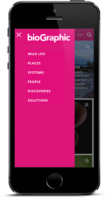
The subject taxonomy helped readers explore by topic: Wild Life, Places, Systems, People, Discoveries, Solutions.

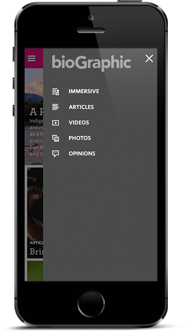
The format taxonomy offered another path for discovery, while also informing which templates and modules the publishing system used: Immersive, Articles, Videos, Photos, Opinions. A photo essay and an opinion piece need different modules even when they share a subject. Tagging a story by format meant its layout came with it: the format determined which template and modules the system used, rather than each story being assembled by hand for every story.

Arranging stories chronologically would have been visually straightforward, but it would have required stories to arrive in coordinated groups to preserve the composition. Letting editors adjust the arrangement gave them more flexibility, and let the publication grow without tying the release schedule to a fixed visual layout.
Mobile navigation drawer showing the subject taxonomy: Wild Life, Places, Systems, People, Discoveries, Solutions.
Subject. Browsing by interest.
Mobile navigation drawer showing the format taxonomy with icons: Immersive, Articles, Videos, Photos, Opinions.
Format. Browsing by kind, and the field the system uses for a template.
Notebook spread working out the content model, weighing chronological against by-topic ordering, with notes on how stacking each new story would force stories to arrive in groups.
Exploration of the content model, as well as how each ordering choice would affect the editorial calendar and homepage arrangement.
Part 2

Turning the design system into an editorial tool

The system is built from modules that stack to form a layout, with elements inside them that populate from story metadata. Information such as the author, date, category and excerpt was handled through structured fields rather than laid out manually for every story.

Early considerations were given to the frame before any visual design, with the share affordance, text structure, and lightbox pattern specified as part of the grid rather than added later. Elements shift and stack at smaller widths because they were sized in units from the start, allowing for flexibility at different screen sizes.
Wireframe headed "1200 desktop" on a 100 pixel grid module, with a share icon legend and an annotation marking where a thumbnail opens a lightbox.
The frame, before any visual design. Stacked modules, including video, text structures, and lightboxes developed as part of the grid system.
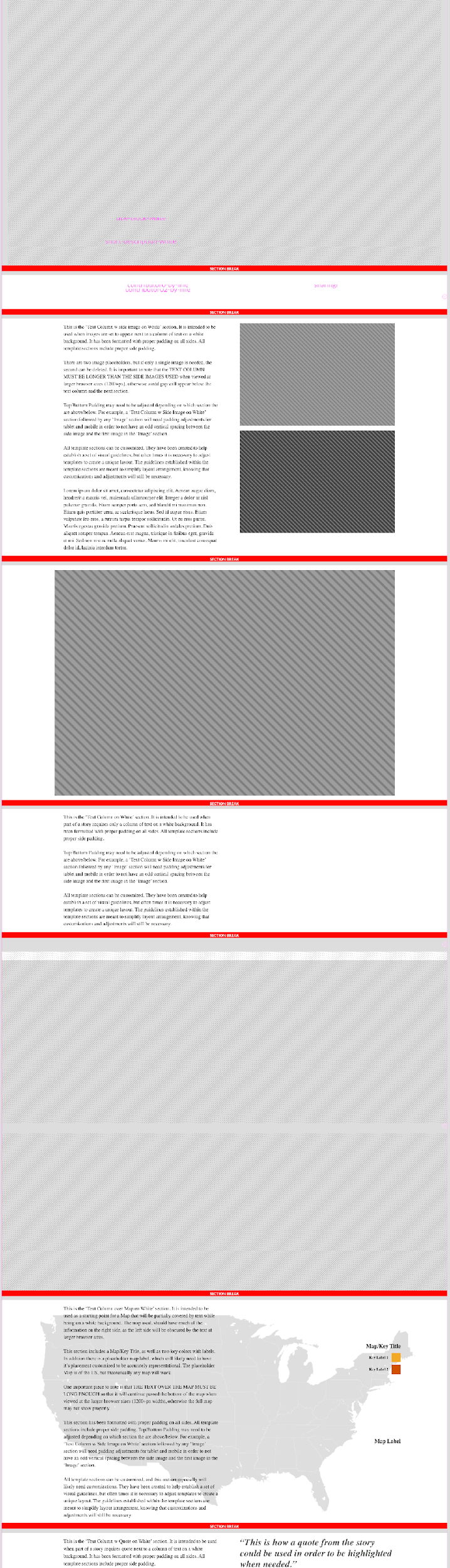
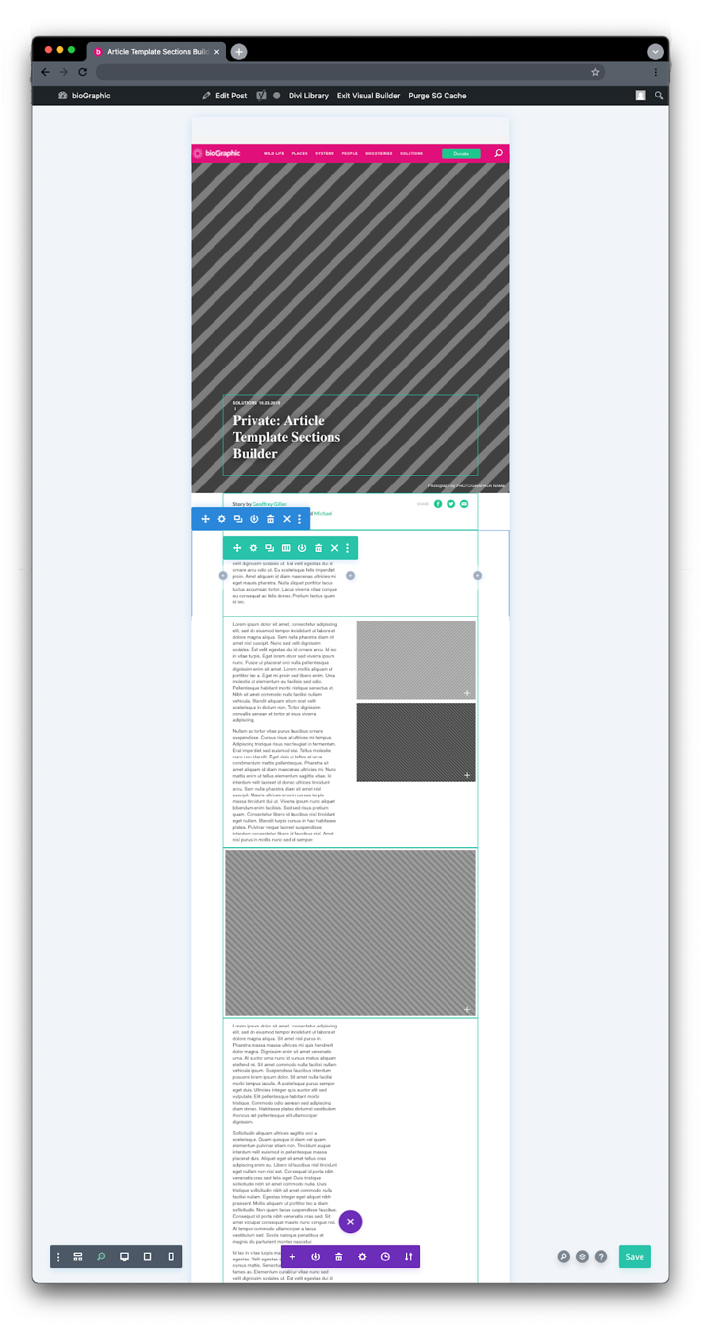
Greybox wireframe of a full story page with each stacked module outlined in red.
Modules stacked reveal the structure of a story.
The same story page built out, with photography, video and a data visualization filling the modules.
The same story, built out with final components and assets.

Templates, and the documentation that made them usable

Modules alone still left too many decisions open, so I built templates on top of them: Article Basic, Photo Essay Basic, Spotlight Image, Opinion, Contributor Blocks.

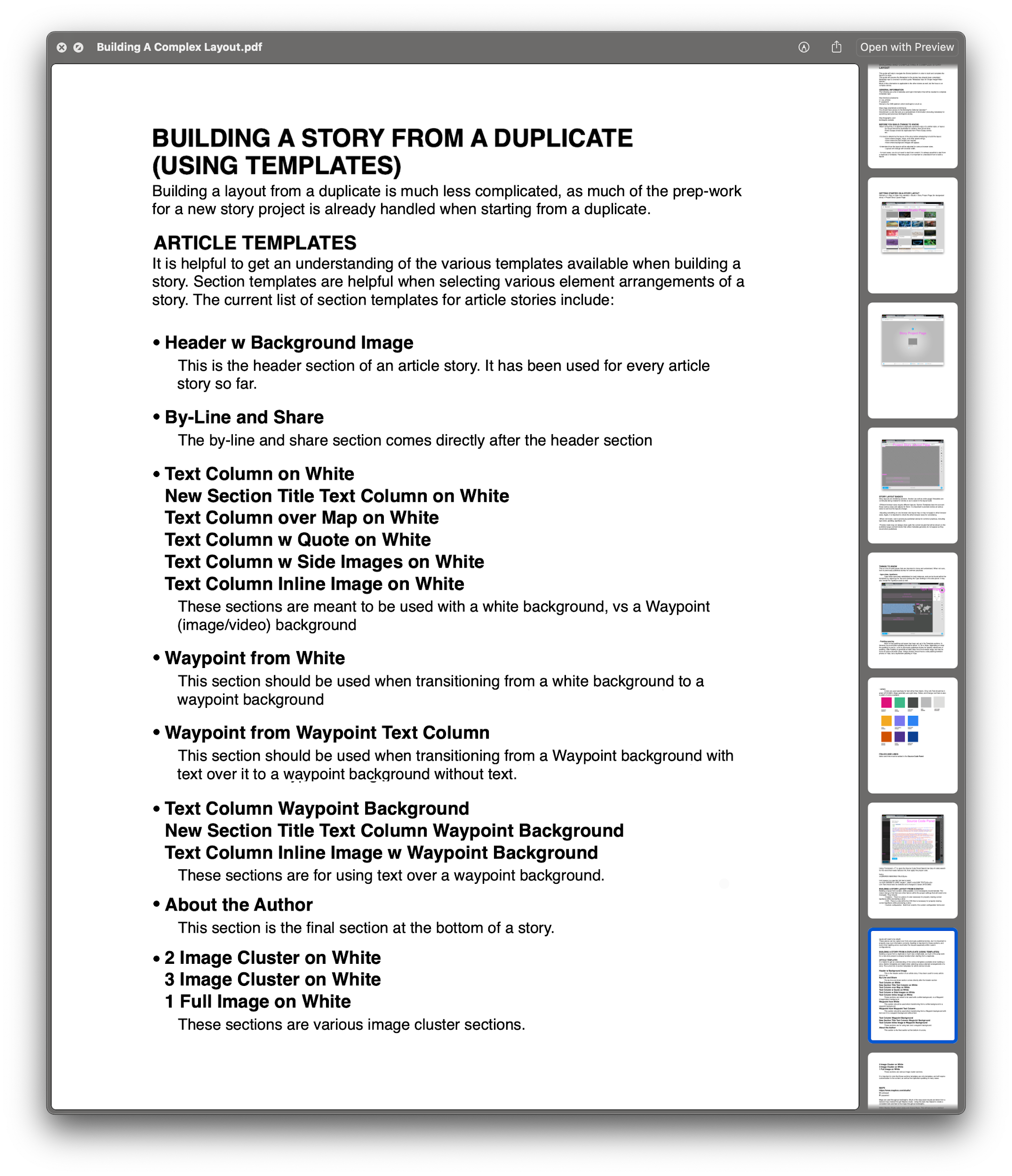
Each is assembled from named sections. Header with background image. Text column on white, with variants for quote, side images, inline image and over-map. Waypoint sections, our term for full-bleed media, handling the transitions into and out of photography and video. Fifteen sections in the article set alone, each with a written note on when to use it.

‍The documentation was just as important as the components themselves. Giving each section a clear name and purpose helped editors understand not only what was available, but when and why to use it.
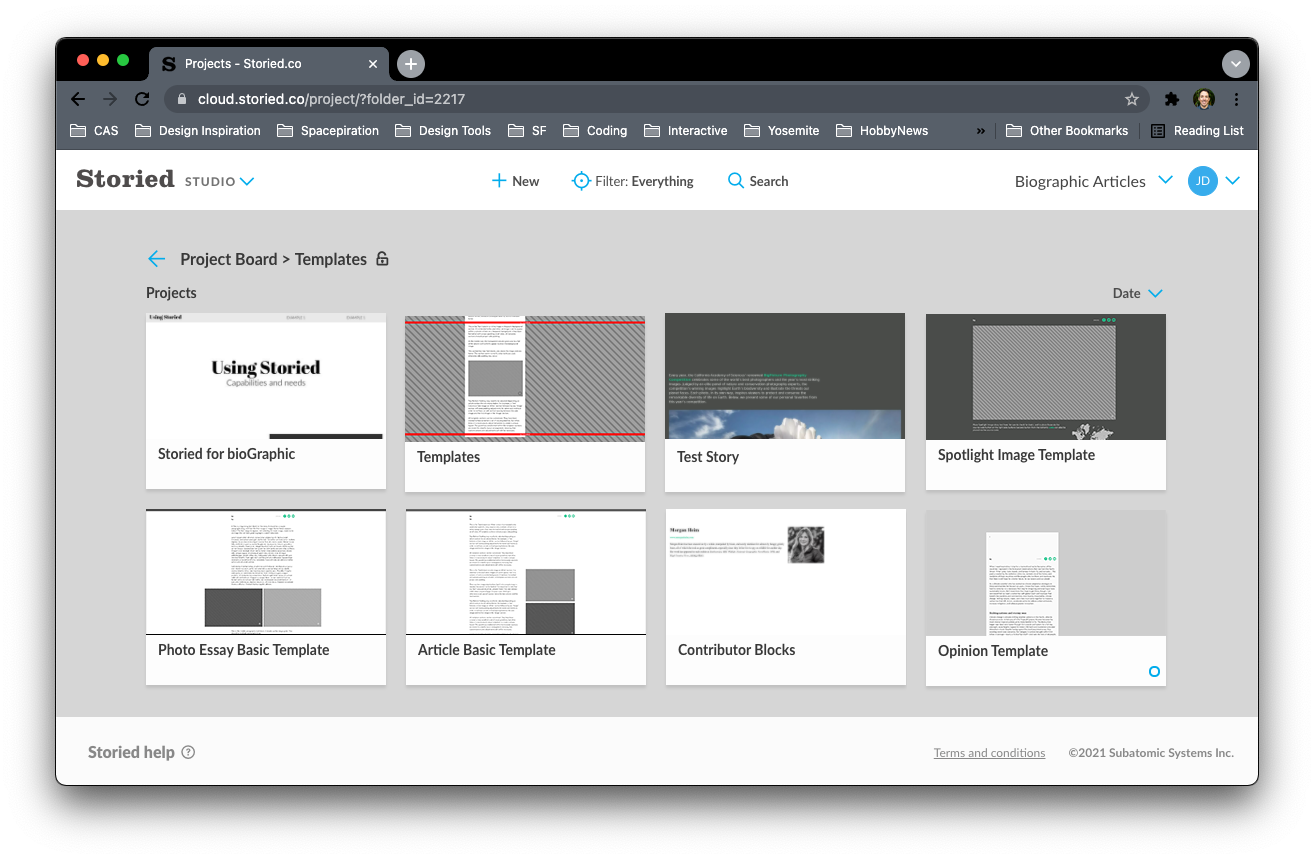
Template library in the CMS showing named layouts including Spotlight Image, Photo Essay Basic, Article Basic, Contributor Blocks and Opinion.
The template library as editors saw it, with each layout named.
Documentation page titled "Building a story from a duplicate", listing each named article section and when to use it.
The written note for each section: what it is, and when to reach for it.

Validating it all

Testing, revising, and testing again

We tested with five readers across ten sessions, two rounds each. After incorporating what we learned in the first round, we returned to the same readers to assess whether the revisions addressed the original points of confusion.

Two findings changed the system rather than a single page.

Readers scrolled straight past the interactivity

Observed
Readers moved through stories by scrolling, almost exclusively. Interactive elements that needed a press or a hover went unnoticed, so the information inside them never reached anyone.
Changed
Instead of making the affordances more prominent, I built the interactivity into the scroll itself. Reveals were tied to scroll position, and any component whose content did not need an interaction was simplified to present the information directly.
Round Two
Readers noticed the reveals and mentioned them unprompted, describing their delight at the way information arrived as they scrolled. Nobody needed to be told how it worked.

Donation and newsletter prompts were invisible

Observed
Readers scrolled past a small donation section without registering it and never clicked through to the newsletter. Asked directly to find either one, they struggled.
Changed
Both were per-story endnotes, so their placement depended on whoever built the story. I made them structural instead: the donation call to action moved into a primary position in the navigation, and newsletter signup became a primary section of the footer. Present on every page, rather than an item at the end of an article.
Round Two
Readers could find both without prompting, and both saw meaningful lifts in engagement once live.
Navigation also simplified as a result of the first round: readers were not using the structure the way the taxonomy had assumed they would.

The scroll finding shaped the most. It confirmed a direction set much earlier, in a wireframe that specified waypoint positions before any visual design existed, and it became the pattern every immersive story followed afterwards.
Scroll-behaviour wireframe annotated with which elements appear, which are clickable, where an animated background was considered, and where the waypoints fire.
Scroll behavior, specified before handoff: what appears, what is clickable, where each waypoint fires.
Part 3

Rebuilding for scale

In 2018 the publication moved from Storied to WordPress. Every story already published had to come with it: more than 150 stories migrated, several of them full-screen immersive articles with custom media behavior.
‍
I built the transition plan and used the move to bring the whole site onto a rebuilt system rather than porting the old inconsistencies across. I had already begun taking on front-end development tasks, which gave me a more direct connection between design and implementation. By the 2018 migration I was able to lead both the system design and its development, reducing handoff time and letting the two evolve together.

The expanded section library

The rebuilt system included around two dozen named sections, all available from a menu inside the CMS: article hero, background image with text overlay, image pairs and clusters, full screen background video, wide layouts, video sections, contributor bio, gallery, a spacing section fixed at 120px, and global header, footer, related content and donate blocks.

The donate and newsletter blocks were added in response to testing, which showed that these calls to action were too easily missed when handled differently from story to story. The related content block earned its place for a similar reason, and became one of the more useful sections on the site.
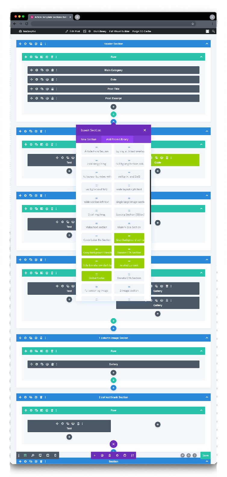
Story assembled in the WordPress visual builder, showing the header section broken into rows for main category, date, post title and post excerpt.
A story as structure: header section, rows, and the metadata fields inside them.
The Insert Section panel listing around two dozen named reusable sections available to editors, including article hero, video text section, image clusters and a fixed 120 pixel spacing section.
The section library, available to any editor from inside the CMS.
Full-length story page redline with modules labelled down the left and measurements marked across, including 1200 pixel maximum content width and 550 pixel maximum column width.
A full story page redlined for the rebuild, with each module named down the left edge.

Working in the system

Both platforms allowed direct access to the code behind a story, and I used it. Storied and later WordPress each handled the common cases well, but the immersive stories needed layouts and elements neither builder offered, so I wrote the HTML and CSS for them: the frames that held a data visualization, specialized elements for specific immersive story interactions, and the responsive rules that such elements interactive and readable on a phone.

Working this way changed what I could put into the library. A section I had built was a section I could specify accurately, name, document and hand to editors as a reusable option. It also shortened the distance between a design decision and the evidence of whether it held up, since I was the one implementing it. The 2018 rebuild ran on the same footing, with the design and the front end developing together rather than in sequence.
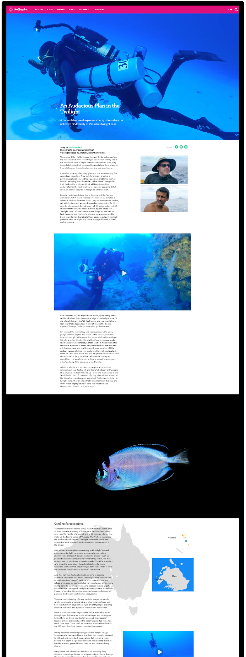
The "An Audacious Plan in the Twilight" story page, combining video, photography, and data visualization in a full-screen scrolling layout.

An Audacious Plan in the Twilight

An Audacious Plan in the Twilight, the first immersive article, at two widths.
The bioGraphic homepage shown at desktop, tablet, and phone widths, with modules restacking at each size.
The homepage, with the grid restacking and the subject drawer open on mobile.

Outcome

For editors, the clearest result is a change in who does the work. Story layout began as a designer-led task: every piece came through me. By the end it was editor-led. The templates and documentation made that transition possible. Editors could create and publish distinctive stories independently, using previously published pieces as reference, while I shifted from building every layout to providing consistency, guidance and design oversight.

‍For readers, the changes showed up where testing predicted they would.
  • Information arrived through scrolling rather than through interactions people were not performing.
  • Newsletter signups and donation clicks both rose notably once those prompts became structural rather than per-story.
  • Suggested articles at the foot of each story converted readers from one piece into a second.
  • Readership continued to grow.
For the Academy, the change with the most direct value was the smallest one. Newsletter signup and the donation prompt had been per-story endnotes, placed differently depending on who built the story, and testing showed readers were missing both. Moving them into the navigation and footer as standing elements lifted signups and donation clicks noticeably. For a publication funded by membership and philanthropy, those two are not proxy metrics. They are the point.

The clearest evidence that the system scaled is the archive it went on to hold. The 2018 migration moved just over 150 stories onto the rebuilt platform. By the time I left the Academy it was carrying close to 400, on the same taxonomy, module library and templates. Today it holds more than 600.
‍
The 2018 system ran until July 2026, when bioGraphic became an independent publication and stepped away from the Academy. Eight years in production on that build, and a decade on systems I designed and maintained.

What I learned

This project changed how I think about design systems. Their value is not only in creating consistency, but in helping people make confident decisions without needing a designer beside them. For bioGraphic, clear documentation became as important as any individual page or component.

Testing taught me to design with the behavior I could observe rather than the behavior I hoped for. Readers scrolled, so the most useful answer was to move the content into the scroll rather than to make the interactions more insistent. The donation and newsletter prompts followed the same logic: the improvement came from where they lived in the structure, not from asking harder.

I also learned the value of documenting problems before proposing solutions. Writing down the interaction and publishing issues gave the team a shared understanding of what needed to improve, and made the reasoning behind each recommendation easier to follow.

Taking on development deepened that understanding. Implementing my own specifications showed me where design decisions held up, where they created unnecessary complexity, and how to make future handoffs clearer and more practical.