Stanford GSB Templates & Systems

Scalable websites, templates, and communication systems for Stanford Graduate School of Business.
Project Overview
As a Multidisciplinary Designer with Stanford GSB’s Teaching & Learning Hub, I work across web design, visual communication, content strategy, and system development. This work includes coordinating the migration of more than 40 faculty websites, redesigning the Teaching & Learning Hub website, and creating reusable digital systems for academic teams.
My Goal
Create clear, flexible digital systems that help faculty and academic teams communicate their work while reducing long-term maintenance and production needs.
Faculty Website Migration
A scalable system for faculty websites
Stanford GSB maintained a collection of faculty websites built over many years in WordPress. The sites varied significantly in structure, content, visual quality, and technical complexity. When the existing hosting environment was scheduled for retirement, our team needed to migrate the sites to a more sustainable platform without losing the individual character or content needs of each faculty member.
A legacy experience with limited hierarchy and a rigid content model.
Content retained within a clearer, more flexible Stanford-branded system.
A varied collection of sites
Sites ranged from simple single-page profiles to extensive libraries of publications, research, media, teaching materials, and custom functionality.
High-touch stakeholders
Every site represented an individual faculty member’s work. The process needed careful communication, individual review, and room for revision.
More than a visual redesign
The platform change required content auditing, information architecture, accessibility review, redirect planning, and decisions about older pages.
Understanding the existing system
Finding shared patterns across meaningful differences
Before developing the new templates, I reviewed the existing faculty sites and grouped them by content type, complexity, and homepage structure. Identifying common needs, such as biographies, research listings, publications, teaching materials, contact information, and featured work, helped us avoid treating more than 40 sites as entirely separate redesign projects.
Sites were categorized as full-page image homepages, basic bio and contact sites, “Basic Plus,” dynamic homepages, and content-heavy sites.
Building the template system
Adaptable by design
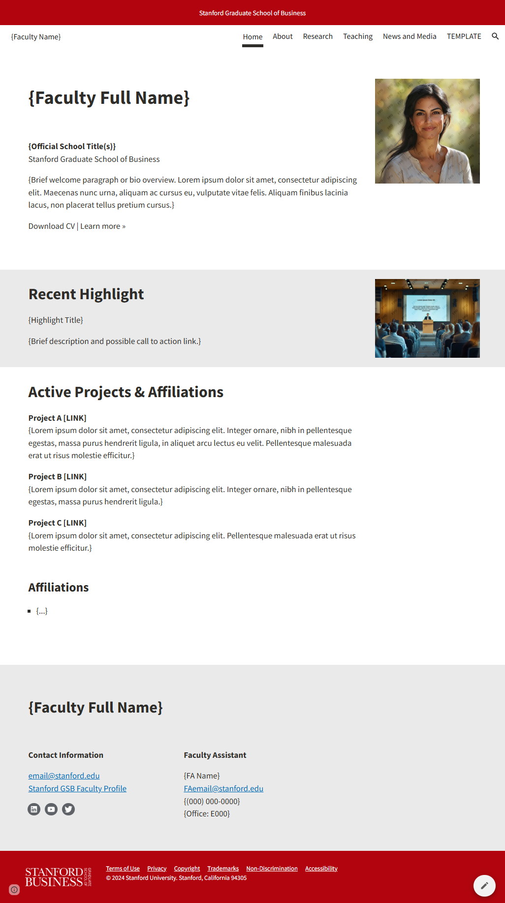
I developed a Stanford-branded Google Sites template with reusable page structures for common faculty content. Clear hierarchy, familiar editing tools, accessible formatting, and flexible modules balance institutional consistency with individual ownership.
Reusable homepage structure
Biography, highlights, projects, affiliations, and contact information.
Flexible research pages
Topical organization, featured work, publication lists, and expandable content.
Adaptable visual system
Stanford GSB alignment shaped around individual content and priorities.
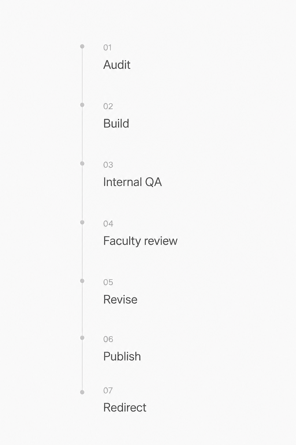
A repeatable path from assessment to launch
Each site moved through the same overall process, with an adjusted migration plan for specialized content, older direct links, or complex research structures.
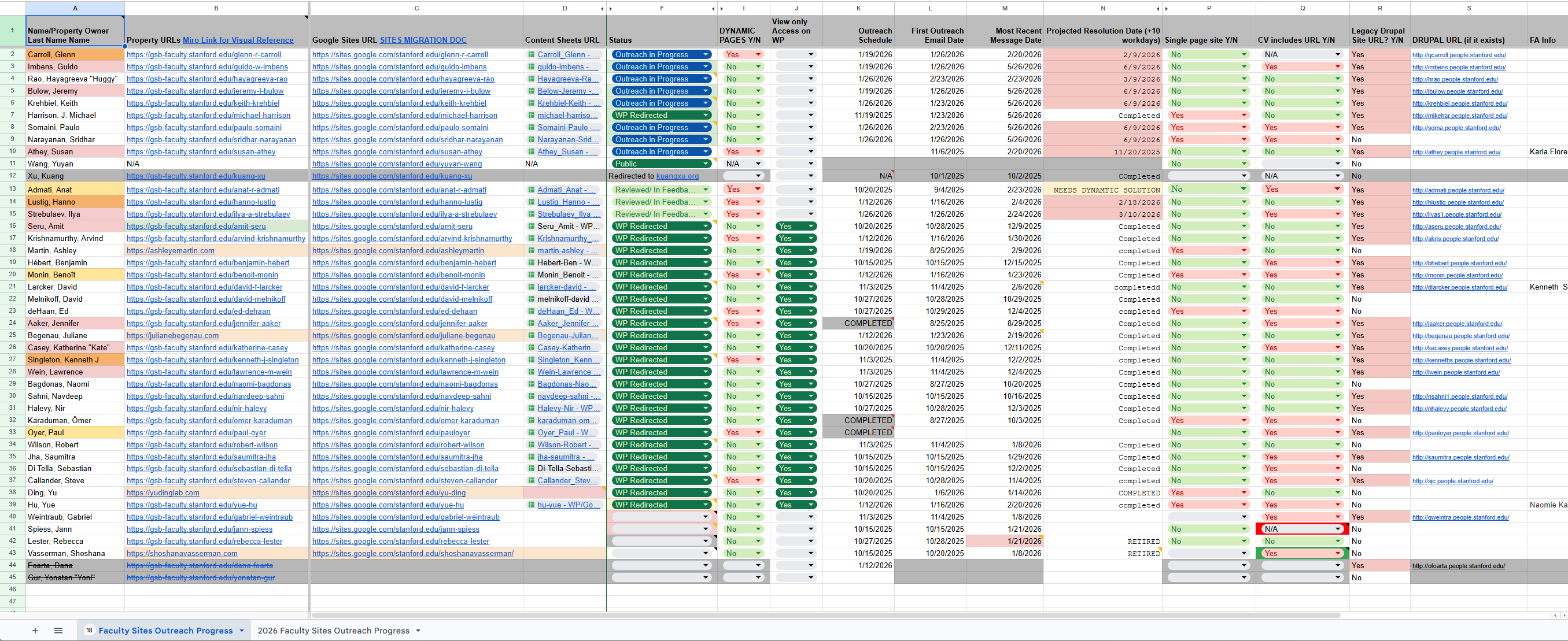
Making parallel work visible
I created and maintained a central tracking system for site status, outreach history, content sources, dynamic-page requirements, redirect considerations, and outstanding faculty decisions. This simplified representation uses fictional identifiers to protect internal information.
Teaching & Learning Hub
Designing a clearer home for teaching resources
UX and visual designInformation architectureDrupal implementationContent organizationPresentation and template designWordPress front-end support
Stanford GSB’s Teaching & Learning Hub supports faculty and staff with teaching resources, academic technology, and course-development services. I reorganized the site around primary audience needs, established a clearer information hierarchy, and introduced a more consistent visual system.

The redesign made resources easier to discover while giving the Hub a more cohesive and recognizable digital presence. Working directly with faculty helped the team use design and storytelling to illuminate complex ideas across websites, classrooms, and teaching materials.
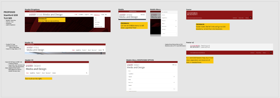
A review of existing content and visual components revealed inconsistent patterns, duplicated approaches, and opportunities to build a more coherent system.
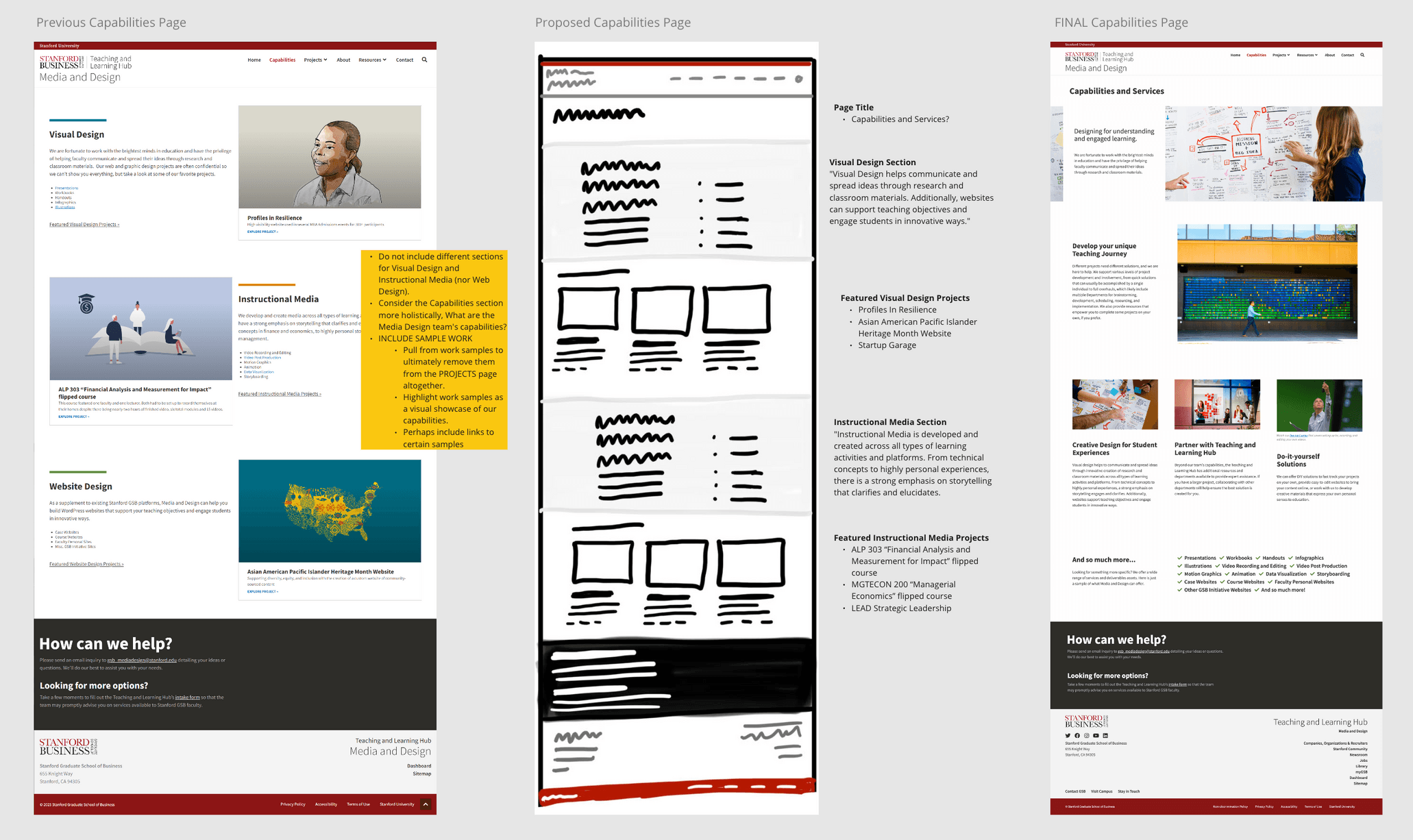
The capabilities page moved from a fragmented collection of services to a structured layout that helps faculty understand what the team offers and where to begin.
Giving the team a visual identity, I developed a visual direction built around clarity, creativity, and connection, applying it across the website, and supporting communication materials.
Combined Outcomes
Across these initiatives, I created digital systems that support very different audiences and content needs while maintaining a consistent institutional foundation. The work improved how faculty and academic teams organize, publish, and maintain information while reducing duplicated effort and making future updates more manageable.
What I learned
Designing for academic teams taught me the importance of balancing usability and clarity with brand consistency. Accessibility and legibility are non-negotiable in educational tools. I also learned how scalable systems can democratize content creation, especially when paired with thoughtful documentation and support. Empowering non-designers with good systems amplifies the impact of design.